With the latest of Android and TouchWiz, the Samsung Galaxy W I8150 takes a support-and-assist role to the company’s flagship – the S II. The Galaxy W is powered by the same 1.4GHz processor we know from the Galaxy S Plus. Ditching the SuperAMOLED screen in favor of a standard issue S-LCD should make the Galaxy W more affordable. Bottom line is the Galaxy W is a Galaxy S Plus in disguise: it looks good but doesn’t come with any SuperAMOLED awesomeness. It’s a modern and understated Android to offer some high-end services on a midrange budget. As you can see, the Galaxy W should allow you to do almost everything its superiors can: playing games, stepping up your social life, browsing the web or capturing the world around you. Surely, there will be a thing or two missing but we won’t pass any judgment before we get the bill.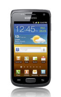
Samsung Galaxy W official photoSamsung Galaxy W I8150 at a glance:
Samsung Galaxy W live pictures
Design and construction
Some might be tired already of the countless Galaxy S facelifts. We guess the Samsung Galaxy W I8150 is a distant relative too but the styling is different - in a good way. At 3.7-inches the screen is big but easy to manage and the textured rear makes it look solid - bordering on rough.
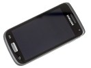


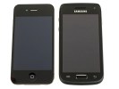
Samsung i8150 Galaxy W • Galaxy W next to an iPhone 4
The Galaxy W's 3.7” screen is an LCD unit (S-LCD according to some sources, but no word from Samsung yet). It won’t get you the deepest of blacks, but it’s a decent screen with nice viewing angles.
The downside is the reflective and not particularly bright display is difficult to use outdoors on a bright sunny day. And the fingerprint prone surface doesn’t help either.
Moving on, a video-call camera is right next to the earpiece above the display. There are also a couple of hidden sensors there: one for proximity and another one for ambient lighting.
Underneath the screen, we find two capacitive keys surrounding the edged, metallic Home key . The haptic enabled Menu and Back keys have extra functionality upon a long-press (task switcher, virtual keyboard, voice search).
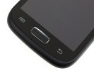
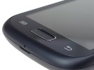
The three controls below the screen
There is a thin volume rocker on the left side, while the Power/Lock key is the only control on the right.
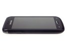
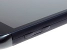
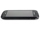
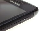
The volume rocker is on the left • the Power/Lock combo - on the right
At the top we find the 3.5mm audio jack and the microUSB port under a plastic flap.
As usual, at the bottom of the phone, you will see the mouthpiece.
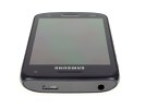
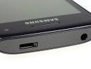
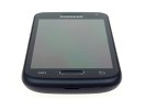
Galaxy W's top and bottom sides host the usual
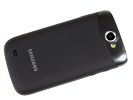
The Samsung Galaxy W’s rear features the 5 megapixel camera lens, complete with a LED flash and the small loudspeaker grill at the bottom.
The lens and LED are placed within a strip of faux-metal, which is a nice accent. The rest of the surface is the finely textured battery cover, also made of plastic.

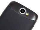
The 5 megapixel camera lens at the back
The microSD card slot is under the battery cover, but it’s still hot-swappable. The SIM compartment is right next to it.
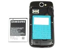
The microSD slot is hot-swappable
There’s a 1500 mAh battery inside the Samsung Galaxy W I8150, but there is no official quote on the battery life yet. We bet the performance would be on par with the likes of the Samsung Galaxy Ace or the HTC Desire S.
Generally, we have no complaints about the all-plastic Samsung Galaxy W. It is a well-built phone, with a solid masculine look. It’s easy to handle and the differently patterned surfaces are nice accents on what’s an overall clean design.
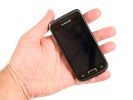
Samsung Galaxy W I8150 held in hand
TouchWiz on Gingerbread
The Samsung Galaxy W I8150 runs Android 2.3.3 Gingerbread out of the box, skinned with TouchWiz 4.0. It's the latest software available, and effectively the same package as on the Galaxy S II.
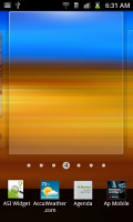
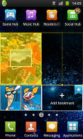
You get up to 7 screens to fill with widgets. The numbered dots that identify the homescreen panes serve as a scroll bar too. A press and hold on the dots lets you scroll sideways through the resized images of the available homescreen panes in one short go rather than with several swipes.

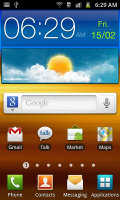
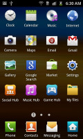
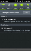
The TouchWiz 3.0 user interface comes preinstalled on top of the Android OS
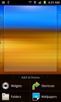
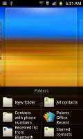
The pinch zoom out is not enabled on the Galaxy W’s homescreen either due to the early software build or some hardware limitation. A press and hold on any homescreen works though (or Menu, Add) and lets you pick one of four ways to customize the homescreen – add widgets, add shortcuts or folders, or change wallpaper.
In screen edit mode, widgets are docked at the bottom and scrolled horizontally. When you’ve found the one you need, it can be dragged onto the screen. It’s similar to what we’ve seen in Bada, but with some 3D eye candy. Shortcuts and folders are picked from vertically-scrollable grids.
Some of the widgets can be resized just by dragging the corner much like with widgets on the MotoBLUR UI. It certainly gives you a lot of flexibility over use of screen real estate. Important widgets can be expanded to show more info, while the less frequently used ones can be made smaller to save space.
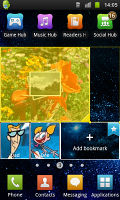
The Galaxy W has four buttons docked at the bottom of its homescreen, which stay there even when you open the menu. You can remove or change them (except the home button which is fixed).
The main menu consists of side-scrollable panes, much like the homescreen. You can add new pages manually, by dragging an app to a new screen in edit mode. You can add folders to the menu too – just drag shortcuts from the menu to the Make Folder icon and give it a name.
Folders cannot be put inside folders and they use the icon of one of the apps inside, making them terribly hard to spot. We hope Samsung fixes that since we spent a few minutes looking for our new folder when it was right in front of us.We wish it was possible to place folders in the bottom row of four shortcuts.
When the app launcher is in edit mode, you can uninstall applications (only the ones that you installed) just by tapping on them. Tapping a folder will delete it, returning the apps back to the flat menu.

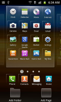
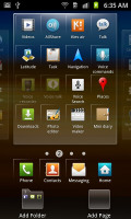
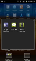
The main menu • Editing the menu • Creating a new folder
The notification area, one of the Android strengths, has five switches for Wi-Fi, Bluetooth, GPS, sound and rotation-lock – just like the Galaxy S II. These are always accessible (unless there’s an app running in fullscreen mode, e.g. a game).
There’s the task manager too, which lets you terminate apps and clear RAM. You don’t normally need to do that since Android is pretty good at handling that kind of stuff, but power users will enjoy it nonetheless.


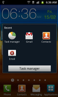

The notification area and the lock screen
Android gallery and MyFiles app are here
The Samsung Galaxy W uses the standard Android gallery as every other Samsung droid. The gallery automatically locates the images and videos no matter where they are stored. It even imports the online photos from your Google Picasa web albums.
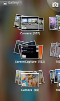
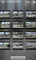

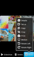
The gallery certainly is a looker
Little about the Gallery should surprise you – aside from displaying full-res images and the addition of the two-finger tilt zoom, there’s nothing new, really. And don’t you worry, the double tap and pinch zooming are still there.
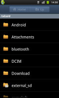
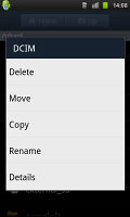
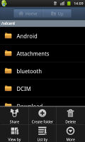
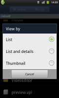
The My Files app is a simple to use but functional file manager. It can move, copy, lock and rename files in bulk, even send multiple files via Bluetooth. My files will only browse the memory card and the large internal storage (it can’t access the system drive).
The My Files app
1 Huron Street, Takapuna, North Shore 0622Tel: (09) 551-5344 and Mob: (021) 264-0000
Web - FaceBook - Localist - Posterous - Twitter - Blogger - Flicker - Map - Email
Why Dr Mobiles Limited?
> No inspection fee at all!

No comments:
Post a Comment