Sony Ericsson have always done a good job of putting big ideas in a small package. The original Xperia mini lineup wasn't ridiculously powerful but had plenty of personality. The pint-sized smartphones did well on the market and you can bet the successors are keen to build on their good start. The Xperia mini pro is under the lights today and ready to raise the bid. We can imagine the Arc and the Xperia Pro calling this one junior. Not even a hint of condescension in that though. The Xperia mini pro has the same hardware as its bigger Xperia siblings, a fact that makes the level of miniaturization all the more impressive. There's room for a proper QWERTY keyboard at that. And there is a Reality display too, a solid battery and HD video recording. Android 2.3 Gingerbread is in charge. A respectable list of features and we're only starting. There is so much more to explore. Before we go on though, let’s take a closer look at all the key facts and figures, and the potential deal breakers. For such a small handset, the Xperia mini pro leaves no major feature out. Not a phone to put up with being looked down on. Not after meticulously upgrading everything there was to upgrade about the original Xperia X10 Mini pro. Surely it can’t be the perfect smartphone - not even trying to impress with raw power. The Xperia mini pro is more likely to surprise you and slowly work its way into you. We hope you're ready to explore this compact smart messenger because our hardware tour is about to begin. The Xperia mini pro has a lot to offer there.

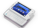
Sony Ericsson Xperia mini pro official photosKey features
Main disadvantages
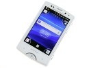
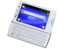
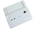
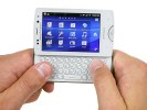
Sony Ericsson Xperia mini pro live pictures
Big box, standard kit
The Sony Ericsson Xperia mini pro comes in quite a big box but the contents are nothing out of the usual. A microUSB cable, a charger and a standard single-piece handset is all you get. There are a few leaflets too, while the 2GB microSD card is already inserted in the phone.
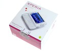
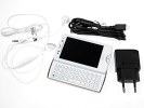
The Xperia mini pro retail package
Sony Ericsson Xperia mini pro 360-degree spin
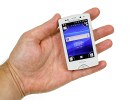
The Xperia mini pro has almost the same size as its predecessor; it's barely a couple of millimeters in each direction. At 92 x 53 x 18 mm, this is still among the smallest QWERTY messengers. It seems the upgrades have added a bit of weight though. The new model weighs 136 g, up from 120, but no big deal compared to what you get.
Design and construction
The Sony Ericsson Xperia mini pro has the look and feel of its Xperia X10 predecessor: a small, pocket-friendly messenger that offers a lot for its size and price. Some clever use of space and there's suddenly room for a 3" screen in what's virtually the same package.
We're having the pleasure of a white Xperia mini pro. It's entirely made of plastic: the battery cover has glossy finish that usually gets all smudged up in no time, but fingerprints are nearly invisible on the white paint. Those are inevitable on the screen of course.
There's little in the way of embellishments, which the white body seems to do well without. Two silver strips on both sides of the Xperia mini pro are the most conspicuous accents. The Home key up front and the QWERTY deck have the same trimming. The phone looks good in a simple, fresh way.
The Sony Ericsson Xperia mini pro has a 3” HVGA touchscreen – a scaled-down version of the so-called Reality display in the Arc and Neo. It's been scaled down both in size and resolution, but still a notable improvement from the original 2.55" QVGA display.
The LED-backlit LCD unit is enhanced by Sony’s proprietary Bravia Mobile Engine. The display produces really nice colors, has decent contrast but the viewing angles are limited. There's considerable loss of color when viewing at an angle. What we were impressed with is the excellent sunlight legibility.


The small Reality display is excellent
The capacitive screen has excellent sensitivity. The slightest of touches will do for user input to be registered.
Below the display is the usual trio of hardware controls. The difference to the last year's model is the Menu and Back keys are capacitive, with a single hardware control in the Home key. Quite surprisingly, the new Xperia mini pro has managed to both increase screen size and get better controls. The Home button has good press, while the capacitive controls are well-defined, nicely backlit and haptic enabled. All are very comfortable to use.
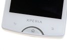
There are three keys at the bottom of the front panel
Above the display, we find a status LED, the earpiece, the proximity and the ambient light sensors plus the video-call camera. The proximity sensor disables the display during calls.
There's both manual and auto display brightness setting and the ambient light sensor is doing a good job of adjusting to the available lighting.
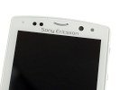
The earpiece is flanked by the status led, two sensors and the video-call camera
The left side of the Sony Ericsson Xperia mini pro is completely bare. The only thing to notice here is a small slit to use and pull the battery cover open.
On the right-hand side, things have stayed the same as before: the volume rocker on top and a shutter key at the bottom. The volume rocker is reasonably comfortable, the up and down keys are prominent and solid to press. The shutter key is super soft, with very deep half press. We liked it. .
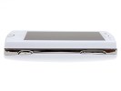
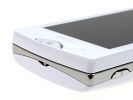
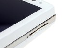
The camera key and the volume rocker are on the right
On top of the handset is the power/lock key. It’s a bit small but easy to reach and press. The other things to find there are a microUSB port, the 3.5mm audio jack and the secondary microphone used for noise cancelation.
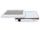
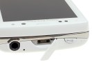
The screen lock key is right next to the Xperia mini pro peculiar audio jack
The bottom of the Xperia mini pro features the lanyard eyelet only. The microphone pinhole is on the QWERTY keyboard near the bottom of the phone.
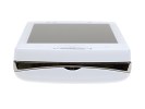
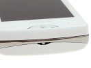
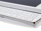
The lanyard eyelet is at the bottom • the microphone pinhole is on the kyeboard
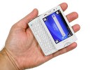
No more teasing, let’s slide the Xperia mini pro open and reveal its key feature: the four-row QWERTY keyboard. Just like its predecessor, the mini pro’s keyboard is reasonably sized and does a wonderful job unless you have really big fingers.

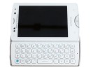
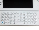

The keyboard is awesome if your fingers aren’t too big
There is enough space between the keys and the press feedback is good. There's something about this keyboard we liked better than the original X10 mini pro. Maybe the keys are a bit more prominent, or the finish is different - making them more tactile. Anyway, there's nothing in this keyboard to complain about. Of course, the size is something to consider - you'd do well to try this messenger to make sure it's a fit.
The back of the Xperia mini pro features the 5 megapixel camera lens and the LED flash. The loudspeaker also goes in here, slightly to the right.
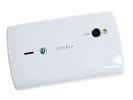

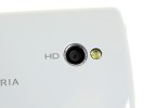
The 5 megapixel camera is joined by the LED flash and the loudspeaker at the back
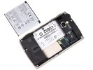
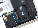
Removing the battery cover reveals the hot-swappable microSD card slot and the SIM compartment.
The 1200mAh battery is said to ideally last 340 hours of standby and 5 hours and 25 minutes of talk time in a 3G network. In reality, the Xperia mini pro managed over 3 days in stand-by, connected to a Wi-Fi network most of the time. When we really put it under pressure though, the phone barely lasted a day. It was always connected to both the 3G and Wi-Fi networks, we did heavy browsing, music and video playback, and the usual benchmarks.
The Sony Ericsson Xperia mini pro is comfortable to handle and fits every pocket. There isn't a more compact messenger currently on the market. The Xperia mini pro is a well-built handset, with high quality, albeit plastic, finish. The slider runs sharp and even, no wobbles and such. The mini pro lives up to its name, efficient and a pleasure to use.
Fast Gingerbread is fast
The Sony Ericsson Xperia mini pro runs Android 2.3 Gingerbread and Sony Ericsson have that covered with the Timescape UI. The mini pro inherits the corner-based homescreen from the previous generation of minis, but Sony Ericsson have done some extra work on it.
The corner UI aside, the rest of the interface is pretty much similar to what we saw in the Arc, the Neo and the Play - though resized to fit the HVGA resolution. Here is a video of the user interface in action.
We guess there should hardly be a person left unfamiliar with the Android 2.3 Gingerbread and the latest Sony Ericsson skin, but we're still going to cover the basics just in case.
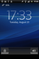
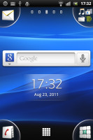
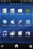
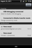
The Sony Ericsson Xperia mini pro UI
We quite like Sony Ericsson's Overview mode on the homescreen. You pinch to zoom out on any of the 5 homescreen panes and a new pane sets in with a cool transition effect to display all of your active widgets. If there is not enough space for all the widgets, they start floating on the screen overlapping.
The Overview mode is similar to HTC’s Leap view or what Samsung have on the Galaxy S. However, widgets are not ordered in mini screens, so small that you cannot actually see what’s on each of them. Widgets are shuffled together instead so they can better use the space. They are as big as possible and thus easier to tap on.
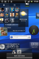
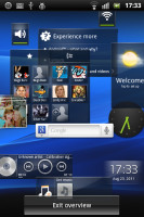
Overview helps you find the widget you are looking for
Now let's see about the four corner tabs on the homescreen. They can host up to four shortcuts each, as easy to assign as a simple drag-and-drop. If a corner has a single shortcut (just the dialer for example), the respective app launches automatically upon a tap. If there is more than one shortcut - the tab expands so you can make your choice properly. You can't put folders there though.
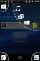
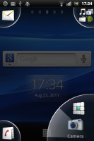
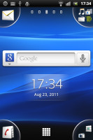
Putting shortcuts in the corners
Creating folders on the homescreen is nice and simple, the way it’s done on the iPhone. You drag an icon over another and a pop-up appears, prompting you to select a name and layout for the new folder.
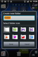
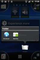
Creating folders is possible too
The Sony Ericsson Xperia mini pro supports both static and live wallpapers. There are 15 static wallpapers and a single live one (Maps), but you can always get more at the Market or use a picture from your personal gallery.
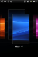
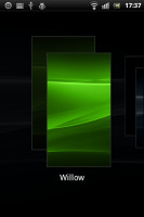
The Xperia mini pro has themes enabled too but the implementation is pretty basic: a theme only changes the wallpaper and the system menus. On a positive note, if you like Sony Ericsson's wave theme but you are tired of watching it in blue, now you can have it in a lot more colors.
Inside the main menu, you will see shortcuts in the bottom corners. They let you sort your icons within the grid – you can either go for the automatic options (alphabetical, most used or recently installed) or you can manually move the icons.

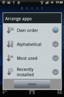
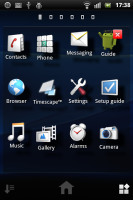
There are different menu sorting options for the app launcher
The new Sony Ericsson app called LiveWare is preinstalled on the Xperia mini pro. It lets you set the behavior of your handset when paired with an accessory. You can have an app launch automatically when headset, headphones or a charger is connected. You can, for example make the mini pro start the music player each time you plug-in your headphones or go to picture frame mode each time you connect a charger.
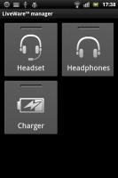
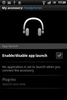
LiveWare lets you have an app launch automatically when an accessory is connected
Text selection is a major change in the user interface since Gingerbread - it's done by placing two large pointers either side of the marked text. You can then drag each of those easily to make the selection you need. It really doesn’t get much simpler than that.
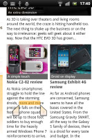
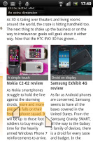
Text selection is improved in Android 2.3 Gingerbread
The Xperia mini pro UI auto-rotates to landscape every time you open the keyboard, but it can also turn using the accelerometer.
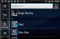
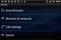
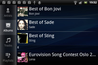

The Xperia mini pro UI in landscape
As far as general performance is concerned, the Sony Ericsson Xperia mini pro does splendidly - no lags, no freezes, no problems whatsoever. It uses a Qualcomm MSM8255 Snapdragon chipset featuring a 1 GHz Scorpion CPU and the Adreno 205 GPU - the same as the Xperia Neo, Arc, Pro and PLAY. But it's even faster because of the lower screen resolution (HVGA). You can see for yourself in the benchmarks below.
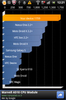
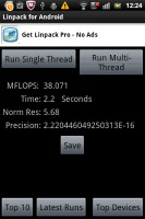
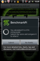
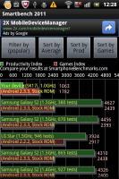

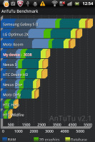
Sony Ericsson Xperia mini pro benchmarks
But it’s not synthetic benchmarks that we should focus on – the real life performance matters here and the Xperia mini pro is smooth as silk. Not that we expected less - Sony Ericsson is getting everything right in this respect lately.
A better Timescape UI
The Timescape brings all your communications together: an aggregate view of your SMS, MMS, email, call log, Facebook and Twitter updates. Timescape has a tabbed structure, allowing you to filter the contents by type and get all relevant information in one place.
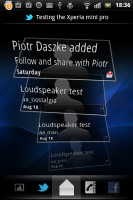
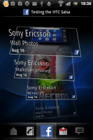
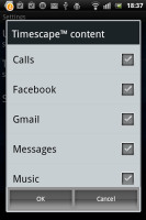
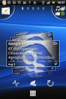
The Timescape app • The Timescape widget
With Timescape you not only see the latest activities and updates of your contacts but also share your own status, reply to received messages or return a missed call.
The best part of the new Timescape is that you can set it as a homescreen widget. It will show all of your updates as tiles. You no longer need to sacrifice all your homescreen real estate.
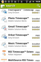
If all these functions are not enough, there are free Timescape plugins on the Android Market for Sony Ericsson users. Currently, you can update your Timescape with mixi, Foursquare, Orkut, Gmail, Music and Photo extensions.
You can find Timescape plugins in the Android MarketThis post is sponsored by: Dr Mobiles Limited
Web - FaceBook - Localist - Posterous - Twitter - Blogger - Flicker - Map - Email
Why Dr Mobiles Limited?
> No inspection fee at all!

No comments:
Post a Comment