You may have a hard time finding this one in the deluge of entry-level smartphones, for which Samsung is in no small part responsible. Don't worry, it will find you. The Samsung Galaxy Fit will be ready and set well before the thought of upgrading ever crosses your mind. The times are long gone when smartphones were scary and complicated. Little green men were a hoax, the little green robots are the real deal. And Samsung are busy carrying out their plan. Match every touchscreen feature phone - every Corby and every Star - with a droid smartphone. The Galaxy Fit is the next in line of mass-market smartphones as Samsung look to simply outnumber the competition where they cannot outplay or outsmart it. The Fit might seem like a minor update of the Galaxy Mini: a tad bigger screen and a 5 MP autofocus camera, but in that price range those are still significant arguments to have on your side. The styling is a little bit subtler, but not in a way to expect it to appeal to business users or an older audience. That said, dropping the original working title of Galaxy Suit makes sense. It just sent the wrong message about the dress code. The Galaxy Fit doesn't have the features to be considered as a business tool. It's a bottom-of-the-food-chain kind of smartphone and it knows it. The friendly little gadget is on the cheap side of smartphones, but keen to deliver complete connectivity and above average imaging. The low-res screen is the flip side of the coin.Key Features
Main disadvantages
Retail box enough to get you started
The Samsung Galaxy Fit is shipped in a small box featuring a MicroUSB cable for computer connections and charging, a charger head, and a 2GB complimentary MicroSD card with an adapter.
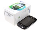
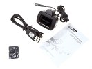
Samsung Galaxy Fit retail box
Samsung Galaxy Fit S5670 360-degree spin
The Galaxy Fit S5670 is compact and welcoming – a smartphone that will put novice users at ease. At 110.2 x 61.2 x 12.6 mm, the handset weighs 108 grams: easy to handle and with a reasonably solid feel.
Compared to the Galaxy Mini, they squeezed a bigger screen in what's basically the same package. That's exactly what we meant when we said the Mini's screen could’ve been bigger.
Design and construction
The Galaxy Fit is a simple all-plastic phone that will not stun onlookers but won't give the wrong impression either. The design is clean, uncluttered, the most prominent accents being the chrome color bezel and the grooved pattern of the rear. The phones looks well built and is nice to handle.
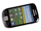
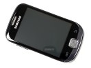
The Samsung Galaxy Fit S5670 front
The front of the device features the 3.3” TFT touchscreen of QVGA resolution. The poor resolution is something users need to accept in a low-end smartphone. The capacitive unit is very responsive and supports multi-touch but the graphics look bad: grainy and with poor contrast.
| Display test | 50% brightness | 100% brightness | ||||
| Black, cd/m2 | White, cd/m2 | Contrast ratio | Black, cd/m2 | White, cd/m2 | Contrast ratio | |
| Sony Ericsson XPERIA Neo | 0.19 | 299 | 1577 | 0.31 | 513 | 1670 |
| LG Optimus Black P970 | 0.27 | 332 | 1228 | 0.65 | 749 | 1161 |
| Samsung Galaxy Fit S5670 | 0.33 | 212 | 640 | 0.69 | 408 | 591 |
| HTC Wildfire S | 0.43 | 256 | 603 | 0.76 | 314 | 414 |
| HTC Incredible S | 0.18 | 162 | 908 | 0.31 | 275 | 880 |
| Motorola Atrix 4G | 0.48 | 314 | 652 | 0.60 | 598 | 991 |
Above the screen, there’s a proximity sensor. An ambient light sensor is missing so you’ll have to manually set the brightness to match changing lighting conditions. Fair is fair though: using the Galaxy Fit S5670 out on a sunny day won’t be a problem.
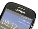
No secondary video-call camera or ambient light sensor
Below the display, there is a single hardware button: the central Home key with two capacitive controls either side: Menu and Back. It's the same layout as in the Galaxy Mini, only the latter has all hardware buttons. The capacitive keys on the Fit don't have haptic feedback - there isn't a setting for that in the menu. Touchscreen haptics are disabled throughout the interface.
The Home button is set within its own frame and in no way interfering with the other two keys. It has a nice feel to it thanks to the brushed-texture finish. It tends to wobble a bit when you place a thumb on, which does feel cheap.
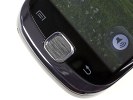
The nice texture on the Home button and capacitive buttons
The top of the phone features the connectivity ports: a 3.5mm audio jack and the MicroUSB port, hidden under a sliding plastic lid.
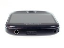
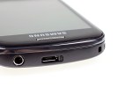
A 3.5mm audio jack • MicroUSB port and plastic lid cover
The right side holds only the power/lock button. It’s thin but sufficiently raised with good press.
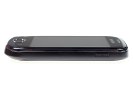
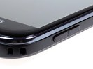
The right side of the phone • Volume rocker
The left side features the volume rocker and MicroSD card slot, hidden under a plastic flap.
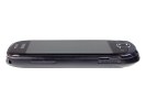
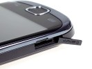
The left side of the phone • The volume rocker and MicroSD card slot
The lack of a proper shutter key is a bigger problem here than on the Galaxy Mini, considering the Galaxy Fit's autofocus camera.
The camera lens at the back has no actual protection against getting scratched in your pocket. There’s no flash of any kind either.
The back has a textured non-slip finish. It doesn’t quite affect the actual grip but makes the device a little more appealing. The matt finish is fingerprint-proof but the thin grooves do tend to gather dust.
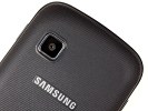
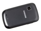
The back panel has a nice texture • Galaxy Fit’s back panel
The loudspeaker grill has got a tiny nub to prevent it from getting muffled when resting on a flat surface.
At the bottom of the phone, the mouthpiece is the only thing to note.
Samsung Galaxy Fit S5670 microphone
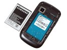
Removing the back panel reveals the 1350MAh Li-Ion battery and the SIM compartment. You shouldn’t expect any miracles in terms of battery life. Android phones are power-hungry creatures and, as we saw with the mini, the low-res screen isn’t enough to make up for that.
Still the Fit easily gets you through a day of really heavy usage, which is, by today's standards, quite a good achievement. Sparing use might even give you a two or three day interval between charges.
The Samsung Galaxy Fit S5670 is a friendly little phone that handles comfortably. The all plastic build is acceptable – the important thing is the phone feels durable.
The poor screen resolution is the thing to consider - though it isn't a deal-breaker for the intended audience. Even the limited app compatibility won't be that much of an issue for people coming from feature phones.
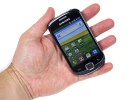
The Galaxy Fit feels good in the hand
User interface
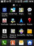
Just like recent Samsung Galaxy phones, the Galaxy Fit runs Anrdoid 2.2.1 Froyo out of the box. It will, however, eventually get updated to Gingerbread. As usual Samsung has thrown its TouchWiz UI overlay, which not only makes the icons look pretty, but also improves general usability. There are four buttons docked at the bottom of the homescreen, which stay there even when you open the app drawer.
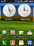
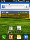
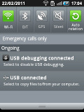
The TouchWiz 3.0 user interface comes preinstalled on top of the Android OS
This little fellow, like any true droid, supports up to seven homescreen panes, which can accommodate every widget and pack of icons you’ll even need. However, if you don’t need all seven of them, the unnecessary ones can be deleted. You can also rearrange the panes as you desire.
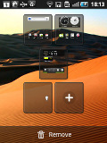
Add, delete or reorder homescreen panes by a pinch to zoom out
Sliding the notification bar down reveals the Android notification area. It is majorly overhauled from the stock Android one and holds five switches for Wi-Fi, Bluetooth, GPS, sound and rotation-lock.
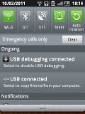
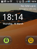
The notification area and the lockscreen
Pressing the menu button while on the homescreen lets you add variety of content on it (a press and hold on the homescreen does the same thing), add or delete homescreen panes, change the wallpaper or quickly access the settings menu. Live wallpapers are supported as well with only one coming preinstalled and many more available in the Market. The contextual menu has shortcuts too for search and notifications.
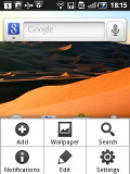
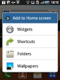
Homescreen edit mode • Wallpaper menu • The widget list
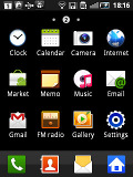
Typically, the main menu consists of side-scrollable panes, much like the homescreen, instead of a vertical scrollable grid (like in vanilla Android). List view is not available.
The main menu panes can be rearranged just like the homescreens – pinch to zoom out and you can rearrange the current panes or add new ones. The icons in the panes can also be rearranged to suite your personal needs.
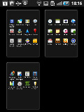
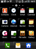
Edit the homescreen panes with pinch zoon out gesture • standard edit mode
An interesting feature in this version of Samsung’s TouchWiz launcher is the built-in task manager. Complete with a homescreen widget that shows the number of currently active apps, it saves you the need to install a task killer.
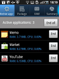
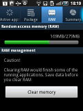
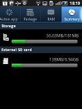
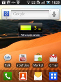
The task manager • the task widget in the center of the homescreen
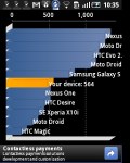
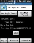
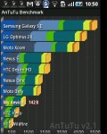
We took some benchmarks with the Galaxy Fit to see where it stacks against the competition. Some of the usual ones we use weren't compatible with the QVGA resolution so they are missing here.
Now those number might not sound impressive, but real life performance is an altogether different matter. Due to the low display resolution the Galaxy Fit had no issues delivering very fast performance and we were really pretty happy with it. It won't lift mountains but will operate without breaking a sweat in your day to day life.
A great TouchWiz enhanced phonebook
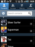
The phonebook of the Samsung Galaxy Fit is plainly said, excellent. It has unlimited capacity and all the functionality you could want. The contacts application displays contacts stored in the SIM card, in your Google account or in the phone memory.
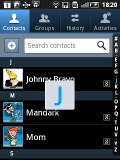
The TouchWiz interface has been at work in the phonebook bringing some special features. Instead of just flick-scrolling the list of people in the phonebook, you can search the entries by either typing the name of the person in the search box or by using the alphabet scroll at the right side of the screen.
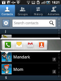
The Samsung Galaxy Fit also packs the quick contacts feature, which first appeared on Android 2.1. Using a single click, it lets you use the contact photo in the phonebook and call, text, or email a contact.
Each contact can have multiple accounts for email and contact synchronization, including Exchange. There are many other details that you can assign to each entry, such as numbers, email addresses, IM, organization, and more. Clicking the plus sigh on the right adds another field of that type, while the minus sign deletes it.
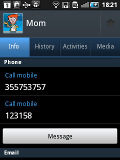
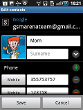
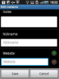
Checking out and editing a contact’s details
The main contact list view hides some useful shortcuts too. Swiping your finger to the right on a name will dial the contact’s default number, while a swipe to the left will start the message composer. The side-sweeping shortcuts are part of the TouchWiz UI and work in other lists too where you have names or numbers (such as the messaging menu).


Swiping on a contact’s name or number in the log will start a call or launch the message composer
Telephony
The Samsung Galaxy Fit handled calls without any hassle. The reception and in-call sound were alright and we didn’t experience any dropped calls.
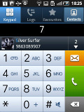
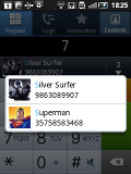
Smart Dialing is available and works beautifully. Tap a digit and it searches both contact numbers and names for it. If more than one contact is found, there’s a number and an arrow, which show you the rest of the matches.
Thanks to the proximity sensor, your screen will automatically turn off during a call. The available options during a call include taking a note, using the keypad, muting, holding the call or adding another call to this conversation.
The call log is situated within the dialer. It shows all the dialed, received and missed calls in one list, which can be filtered to show only certain type of events.
We also ran our traditional loudspeaker test on the Galaxy Fit. It received a good mark and will let you know you have an incoming call in most loud environments. More info on the test itself as well as other results can be found here.
| Speakerphone test | Voice, dB | Pink noise/ Music, dB | Ringing phone, dB | Overall score |
| Samsung I9000 Galaxy S | 66.6 | 65.9 | 66.6 | Below Average |
| Google Nexus S | 68.1 | 66.3 | 69.3 | Average |
| HTC Sensation | 66.5 | 66.6 | 78.3 | Good |
| Samsung S5760 Galaxy Fit | 70.8 | 69.1 | 72.7 | Good |
| Samsung I9100 Galaxy S II | 70.0 | 66.6 | 75.7 | Good |
| Nokia N8 | 75.8 | 66.2 | 82.7 | Very Good |
| HTC Gratia | 73.2 | 73.6 | 83.5 | Excellent |
Rich messaging experience
The messaging application is quite straightforward. It has a new message button and bellow it are all the received messages organized in threads.

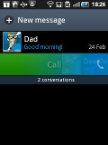

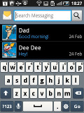
The Galaxy Fit messaging department and swipe functions • the app specific search
The same swiping functionality found in the phonebook has been integrated here as well. A swipe to the left starts a new message, while swiping to the right will start a call.
The application-specific search lets you quickly find a given message among all your stored SMS and MMS.
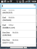
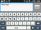
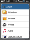
Adding recipients • Adding any multimedia content automatically turns an SMS into an MMS
Tap and hold on a message and a context menu brings up options such as edit, forward, delete and lock as well as view details and copy message text.
A press-and-hold in the tap-to-compose area gives you access to functions such as cut, copy and paste. Once a text is copied, you can paste it across applications like email, notes, chats, etc.
To add message recipients, just start typing the name or number and choose from the list of suggestions.
Adding multimedia content to a text message automatically turns into an MMS. You can just quickly add a photo or an audio file to go with the text or – depending on your needs – you can choose to go into a full-blown MMS editor.
Email is can be handled either by the standard Gmail app or the generic email app. The Gmail one supports batch operations, which allows multiple emails to be archived, labeled or deleted. Multiple Gmail accounts are supported too.

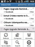
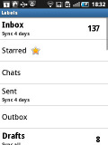

The Gmail should be pretty familiar to everyone by now
The generic email application is used for all your other non-gmail email accounts and supports multiple POP or IMAP inboxes. You have access to the original folders that are created online, along with the standard local ones such as inbox, drafts and sent items.

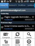

The standard email app also does a good job • the combined inbox
The TouchWiz UI in the Galaxy Fit features a combined inbox, which brings together all your mail in a single folder so you don’t need to check each one for new mail. This can be quite handy if you have lots of accounts and you just want to check if there is a new message needing your attention.
Google Talk handles the Instant Messaging department. The G-Talk network is compatible with a variety of popular clients like Pidgin, Kopete, iChat and Ovi Contacts.
The Samsung Galaxy Fit comes with the Samsung home-baked keyboard preinstalled. Despite the smaller screen resolution, this keyboard feels comfortable to type on.
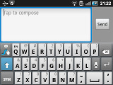
When you flip the phone on its side, the virtual keyboard automatically switches to the landscape mode, which is much bigger and more comfortable to use. It covers most of the screen however, leaving room for only two lines of text.
Voice input is also available and works quite good if you are in quieter environment.
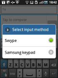
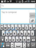
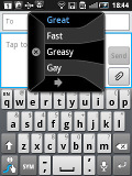
Samsung has generously included Swype for an alternative input method – we covered it thoroughly in the Samsung I9000 Galaxy S review and we won’t go into so much detail here. Swype is a life-saver on the smaller screens (such as the one of the Fit) – you don’t have to be very accurate with your swyping, which makes text input faster and easier. It’s only that, much like with any other text prediction method, it has to support the language you want to enter text in.
Swype input in action • Swype suggestionsThis post is sponsored by: Dr Mobiles Limited
Web - FaceBook - Localist - Posterous - Twitter - Blogger - Flicker - Map - Email
Why Dr Mobiles Limited?
> No inspection fee at all!



No comments:
Post a Comment