Google's newest and best version of Android just became official at the Google-Samsung event in Hong Kong along with the Galaxy Nexus. And although it may seem like it, Ice Cream Sandwich is not just another update to Android but a way to curb some of the inherent issues with the OS, such as fragmentation, that have been plaguing it for a long time.

Ice Cream Sandwich combines the tablet optimized Honeycomb and Gingerbread into a cohesive whole. The unification of the UI and APIs means that developers will no longer have to worry about multiple devices and hardware configurations and just have to develop their apps for one OS and it will automatically work perfectly across all devices. This is what Google promised us at their I/O event when they first announced Ice Cream Sandwich and that is what they delivered today.
Key features
- Optimized for smartphone and tablet use
- New user interface, with a new typeface called 'Roboto', updated animations, transition effects, multi-touch gestures and live wallpapers
- Improved multitasking
- New homescreen folders and favorites tray
- Improved lock screen with facial unlock
- Improved notification menu
- Resizable widgets, viewable through the application menu
- Built-in screenshot utility
- Improved text input and spell-checking
- Improved voice input
- Ability to monitor and control data usage
- Improved accessibility for disabled users
- New Peoples app
- Improved Gmail and Calendar app
- Improved web browser with ability to save web pages and incognito mode
- Visual voicemail
- Improved camera app with face detection and panorama mode
- Improved video recorder with continuous auto-focus, zooming while recording, snapshot while recording and time lapse mode
- Redesigned Gallery app with photo editor
- Android Beam for transferring data using NFC
- Wi-Fi Direct and Bluetooth HDP support
But Ice Cream Sandwich is more than just unification of the smartphone and tablet versions of Android. It brings an overwhelming number of new changes and features to the OS that combine the best of Gingerbread and Honeycomb, while adding some new features along the way, such as the improved lock and notification screen, new camera app, new Peoples app and an improved browser, just to name a few.
Today we’ll be taking a first look at some of the more important features in Android 4.0 Ice Cream Sandwich. So sit back and relax as we take you through them.
User Interface
The user interface on Ice Cream Sandwich has received a great deal of attention. It has the similar robotic theme of previous Android versions and reminds strongly of Honeycomb with it’s dark blue theme and similar UI elements.
Google is using a new typeface on Ice Cream Sandwich, called Roboto, which replaces the original Droid typeface found on previous versions of Android. There are also some new animations and transition effects and a new swipe gesture that works across the OS and lets you remove items from a list simply by swiping on it horizontally.


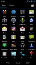
Ice Cream Sandwich lockscreen with Roboto typeface for the clock • Main application menu
The Ice Cream Sandwich UI has a cool, modern look to it that is in a different class altogether compared to the classic, almost timeless look of iOS and the bold and sophisticated look of Windows Phone 7. It remains to be seen, however, if it will age as well as the other two, especially iOS. But if it ever gets boring, you can always change it. That’s the good thing about Android.

Call screen
Now let’s talk about the new features and improvements in the UI.
Multitasking
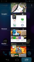
Ice Cream Sandwich borrows heavily from Honeycomb when it comes to the new multitasking UI. You press the dedicated Recent Apps button at the bottom of the screen, which brings a vertical stack of thumbnails for the recently opened apps.

Multitasking in Android 4.0
The thumbnails show actual screenshots of the app instead of just their icons, which makes them easier to identify and see the state you left them in. Apps can be closed simply by swiping them off the screen.
New notifications screen
The notifications screen now shows you icons next to the notification, such as the picture of the person who tried to call or message you. You can even control the default music player from the notification screen without having to switch apps.
Notifications can now be removed from the screen one at a time and all you have to do is swipe on them to remove them from the list. Lastly, the notifications screen can now be accessed from the lock screen as well, so you can see your notifications without having to unlock your phone.

Notification drawer
Improved lock screen
The lock screen now lets you jump directly to the camera app from the homescreen, simply by dragging the lock icon to the camera icon. This functionality was found in Android phones from HTC and Samsung before but it’s nice to see it built-into Android. Having said that it’s a lot simpler in comparison and only works with the camera app for now. It would have been nice to add other applications to the lock screen, as HTC allows you to do.

The new lock screen
Face Unlock
A new feature in Ice Cream Sandwich lets you unlock your phone using your face. Once the phone knows what you look like, all you have to do is point the phone at your face for it to recognize and unlock the phone for you. This saves the hassle of remembering passwords and is more secure than a simple lock screen. It did not work as intended during the demo but we’re hopeful that the final version of the software would be better.

Folders
Although Android had folder support before, creating and managing folders wasn’t as simple and intuitive as it is in iOS. This changes with Ice Cream Sandwich because the folders are now vastly improved. You can drag and drop application icons on the homescreen on one another to create a new folder or directly drag an app into an existing folder. Tapping a folder shows you the contents within and you can even drag the icons around inside the folder.

Ice Cream Sandwich also comes with a new favorites tray, which is like a dock found at the bottom of the screen. In previous smartphone versions of Android, you would have two, non-customizable icons at the bottom of the screen flanking the application drawer button. Now you can have four icons there and they can be of your choice.
In fact you can even drag a folder from the homescreen onto the favourites tray, which gives you access to more than four apps. The favorites tray remains constant at the bottom of the screen regardless of whichever homescreen you may be in.
Resizable widgets
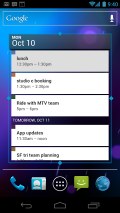
Another carryover feature from Honeycomb, Ice Cream Sandwich allows you to resize widgets on your screen, which lets you manage space better. This feature makes a lot more sense on a smartphone than a tablet due to the relatively small screen. Also, in Ice Cream Sandwich, the widgets now appear in a separate section in the application drawer and you can preview them before applying.

Contacts
Contacts in Android Ice Cream Sandwich have been completely redesigned from the previous version of the OS and are now called just People. The look and feel of the application feels more dynamic and social than before, showing you the status of your friends from GTalk and their status message.
The social element is deeply integrated in the People's app, allowing you to add different connections to any contact, like for instance including them in a circle on Google+. In a single contact view, there's a large profile picture, which should make the experience of viewing contacts more engaging.


List of groups and single contact view in Android Ice Cream Sandwich
Messaging
Since Ice Cream Sandwich is parts Gingerbread, parts Honeycomb, the message apps feels practically unchanged. The keyboard is the same as that found in Gingerbread and that's not a particularly bad thing.
Error correction and word suggestion have been revamped and are now more accurate and can even detect double-typed characters, skipped letters and ommited spaces.

Word correction in Ice Cream Sandwich
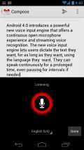
Another revamped feature is the Speech-to-text, which now lets you talk for as long as you have air in your chest and it'll still keep on recording and transforming your speech into text. After you are done, the voice engine automatically underlines words it thinks might have come out wrong so that you can fix them if necessary.

Email
Android developers have spent quite some time making the Gmail application more intuitive and easier to use. As a result the application looks more streamlined and straight to the point without too much visual noise attacking you.
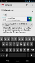
Notably, the people autosuggestion has been also improved and now shows a picture next to the suggested contact. With the new screenshot-taking feature in Ice Cream Sandwich, you can take a screenshot of your phone screen and attach it directly in the email as you are writing it.

Composing an email
With the new Gmail app, you can also set up quick responses and use them when composing. A great usability issue has been addressed by adding nested mail subfolders, which should help you locate and organize IMAP and Exchange emails. With the new Gmail app comes a resizable widget in pure Honeycomb spirit, but in an Ice Cream Sandwich execution.
Web browser
As expected, the web browser in Ice Cream Sandwich has gotten an update and it is now faster than before, with significantly improved performance in benchmarks over the previous version of the browser.
It also adds some useful features such as the ability to sync bookmarks with the Google Chrome browser and an incognito mode, where the browsing history is not saved, a feature that should be more useful on a tablet than a phone.


Other changes include the ability to request the full version of a website instead of the mobile optimized version, a feature that you may have noticed on Opera Mobile before. The browser can now also save pages on the phone for offline viewing, another feature found on the Opera browser.
Lastly, the Ice Cream Sandwich now shows a vertical stack of thumbnails for open windows that resemble the icons in the multitasking menu. Also, just like in the multitasking menu, you can close windows simply by swiping right on them.
Camera
Ice Cream Sandwich features a new camera application. Other than the new user interface, it adds some useful features, such as continuous focus, tap to focus, face detection, image stabilization and panorama mode. There is also a new zero shutter lag exposure, which reduces the shot to shot time considerably.


The video recorder also gets some useful features such as continuous focus while recording, ability to zoom and take a snapshot while recording and a new time lapse feature. Image stabilization also works during video recording. As you read before, the camera app can now be quickly launched from the lock screen.
Conclusion
We were generally impressed with what we saw today. Android seems to be heading in the right direction with Ice Cream Sandwich. It tackles some of the longstanding issues such as fragmentation head-on and if adopted quickly by OEMs should make the life of developers and in turn the users a lot better.
It also takes the stock Android Gingerbread and makes it a lot more functional. Features like the new lock screen, improved camera app, new notifications, ability to take screenshots, hardware acceleration for the UI, improved text and voice input, etc. will certainly go a long way in making the Android user experience richer. Although Honeycomb users have had some of the features we saw today for a while now, it is nice to finally have them on the humble smartphone as well.
But how does it stack up against the competition? Well, Android was the most feature-rich mobile operating system around and Google just went and added a ton more, so it’s certainly ahead of the competition in that aspect.
But how good is it to use in the everyday life? Is it as user friendly as iOS or Windows Phone 7? Will it finally make people get over the stigma of Android being inherently a geek’s OS? Well, that’s something we can find out only after a full review. So keep watching this space.
This post is sponsored by:
Dr Mobiles Limited
1 Huron Street, Takapuna
Auckland 0622
www.drmobiles.co.nz
Tel: (09) 551-5344
Uploaded via iPhone 4
Note:
We are the only professional repair centre who DOES NOT charge inspection fees on faulty phones.
> 1 hour iPhone 4 repair
> Repair while you wait
> Free 30 min parking
> Free loan phone


