They used to be big, later they became redundant. As soon as smartphones were ready to offer the same features, PDAs were on the way to becoming extinct. With a device like the Samsung Galaxy Note though, one can't help but wonder if they're making a comeback. It's got a big touchscreen for reading and entering text, with a stylus for jotting down notes and sketches, with powerful hardware that beats most phones in processing power and features. Sounds like a new-age PDA to us. The screen is part of the new HD SuperAMOLED line and boasts the impressive 1280x800 pixel resolution. It uses a PenTile matrix, but with 285ppi you can't really tell. Stretching over a whopping 5.3 inches, it makes browsing those web pages an almost tablet-like experience. The Samsung Galaxy Note shares the Exynos chipset with some of its Galaxy siblings, but it's the one with the 1.4GHz dual-core CPUs. We've already had a look at its performance and we can say it's blazing fast. If it's becoming hard to keep track of all the features, here's the gist of the Galaxy Note specs in summarized form: The Samsung Galaxy Note packs the same camera as the Galaxy S II, giving you 8MP stills and FullHD video recording. If the image quality is on par, the Note should easily beat its tablet competitors in the photography department. One important area is portability - Samsung have made the device as small as possible (there's hardly any bezel around the screen) but 5.3" is pretty big. Figuring how to carry the Galaxy Note around will be a challenge, but if you find a way you can leave your phone at home - the Note has top of the line droid specs and full phone functionality too. Well, we've got our cargo pants on and we'll try and find room for the Samsung Galaxy Note. The Samsung Galaxy Note has a 5.3" SuperAMOLED screen of WXGA (1280x800) resolution. That's 16:10 aspect ratio, which is close enough to the HD aspect (16:9) to fit videos just right but it's a bit wider, which comes in use when browsing the web. SuperAMOLED offers great contrast (theoretically infinite), saturated, lively colors and 180-degree viewing angles. It's not a 'Plus' model, which means it uses PenTile (2 subpixels instead of 3 per each pixel). But the very high pixel density - 285ppi - puts pixels so near the edge of human vision that you have to stare closely to barely make out the PenTile grid. For comparison, the Galaxy Tab 7.7 display has 196ppi, the Galaxy S II has 217ppi, HTC Sensation XE - 256ppi and the iPhone 4 offers 326ppi. We took some close-up shots of the screen of the Galaxy Note along with the Galaxy S II and iPhone 4 to illustrate the difference. The photos are shot at the same magnification, so you get an idea of how the different pixel densities affects the amount of fine detail in the visible image. You can see the PenTile matrix of the Galaxy Note, but its pixels are closer in size to those of the iPhone 4 than those of the Galaxy S II so the "grid" look typical of PenTile is practically invisible on the Note's screen. Plus, users will typically hold the bigger screen farther from their eyes, which increases the perceived pixel density further. We mentioned that the theoretical contrast is infinite - that's because black pixels are completely switched off (that is, they give off zero light). In practice, reflections limit that to a finite number, but it's usually several thousands, well above any display that uses a backlight. Samsung have gone through a lot of effort to make their SuperAMOLED technology as non-reflective as possible and they've done a pretty good job of it. Outdoor viewing is good, but there's another problem, brightness. The 5.3" screen on our test Samsung Galaxy Note is rather dim. We don't have a retail version, so it might be a pre-production issue that will be fixed. This is probably the case, since we didn’t have this problem with the bigger, 7.7" SuperAMOLED on the Galaxy Tab 7.7. We won't be doing brightness measurements this time around, we'll wait for the retail units to come out and include the results in our review. The Samsung Galaxy Note uses portrait orientation by default and packs practically the same set of controls as the Galaxy S II. This is a Gingerbread device, not Honeycomb like the Tab 7.7, so that's no surprise. Above the screen you have the proximity and ambient light sensors, along with the 2MP front-facing camera. On the other side of the screen is the hardware Home button plus the capacitive Menu and Back keys on its side. There's an earpiece on top and a mouthpiece at the bottom, so you can use the Galaxy Note as a phone. Holding it with one hand is not particularly comfortable but we'll get back to that in a minute. At the bottom, next to the mouthpiece is the standard microUSB port (hooray!), which leaves a quadruple life - it's a data and charging port, TV out port too (via MHL) and supports USB On-The-Go. The bottom is also where the S Pen lives, - that's what Samsung calls the active stylus of the Galaxy Note. On top of the device, there's just the 3.5mm audio jack and another microphone. The sides of the Samsung Galaxy Note are pretty barren - there's a volume rocker on the left and a Power/Lock key on the right and that's it. They are thin and barely protrude, so they're not the easiest buttons to press, but it's not a major problem either. We complete our hardware inspection at the back where we find the 8MP 1080p-video-capturing camera accompanied by an LED flash. The back also houses the single loudspeaker of the Galaxy Note. We have the usual complaint here: the camera lens is not protected from scratches and fingerprint smudges and the loudspeaker gets muffled when you place the Note on a level surface. But most manufacturers seem to ignore such issues more often than not. The back cover is made of finely textured plastic (very similar to that of the Galaxy S II), which is nice to the touch and great at hiding fingerprints. You can see the back of the Note compared to the back of the Galaxy S II and how the two stack up size-wise. Popping the back cover open reveals the 2,500 mAh battery. Samsung are mum on the battery time. Also here is the SIM compartment, next to the microSD card slot, neither of which are hot-swappable as they're blocked by the battery. How Samsung could put the microSD card slot there on such a huge device is beyond us. They have more than enough room to put the slot in a more convenient location. The Galaxy Note is a monster compared to regular phones - but then again, it's not exactly a phone. It's thin (9.7mm), light (you wouldn't guess it weighs 178g) and the rounded edges help ergonomics. But still, one handed use is a problem - your thumb most likely can't reach every point on the screen (certainly not comfortably) and unless you have big hands, you can't easily wrap your fingers around the Note to hold it without fear of dropping. Two-hand thumb typing is absolutely spot on, however. Pocketability is an issue too - you can certainly slip in into your pocket (the thin frame helps a lot here), but a lot of people won't find that solution acceptable. Still, most coat pockets or purses will find enough room for the Galaxy Note, which is worth having around with all that screen real-estate. Web - FaceBook - Localist - Posterous - Twitter - Blogger - Flickr - Email Why Dr Mobiles Limited?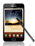
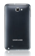

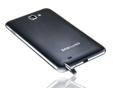
Samsung Galaxy Note official photosSamsung Galaxy Note at a glance
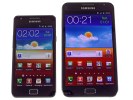
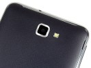
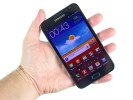
The Samsung Galaxy Note at our officeDesign and display

Screen size comparison: Galaxy S II vs. Galaxy Note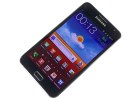
The 5.3" SuperAMOLED of the Galaxy Note is impressiveThe rest of the body
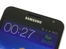
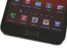
The usual set of sensors above the screen and the hardware controls below it
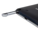
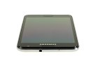
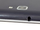
Mic pinhole microUSB port and S Pen at the bottom • 3.5mm audio jack and another microphone on top
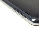
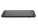
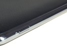
Volume rocker on the left • Power/Lock key on the right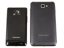
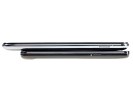
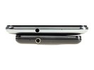
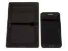
Size comparison: Galaxy Note vs. Galaxy S II and Samsung Galaxy Note vs. BlackBerry PlayBook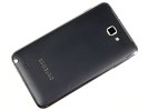

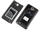
The 8MP sharpshooter and the loudspeaker at the back • 2,500 mAh battery under the cover
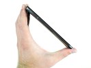
The Samsung Galaxy Note held in hand
_____________________________________________________________________________________
sponsored by Dr Mobiles Limited (Location Map)
1 Huron Street, Takapuna, North Shore 0622, Tel: (09) 551-5344, Mob: (021) 117-2222
> Repair while you wait
> Free insurance calims report
> Free inspection on faulty phones|
> Free 30 minute off-street parking
> 45 mins to fix iPhone 4 scree
> 30 mins to unlock 3G and 3GS
> 25 mins to replace 3G/3GS screen
Wednesday, October 12, 2011
2011 Smartphone review: Samsung Galaxy Note
Top 5 Steve Jobs Moments (via http://www.mevio.com)

America's most talked about CEO has officially resigned from his position as CEO of Apple. This news was a huge disappointment for Apple employees and consumers, and here's why.
Steve Jobs has been one of the most influential and innovative entrepreneurs in history, creating technologies most of us now, cannot live without.
The Macintosh. When the first macintosh was released, the American population said "so what" We didn't want to learn a whole new operating system that seemed a little bland.
So Jobs personally took on this product, to redesign it and make people want it. He spent 5 years developing the new mac.
When he was finished, it was the beginning of Apple's Winning streak.
You now look at people in a library or around the office and it just so happens that the majority of computers surrounding you are macs, due to Mr. Job's.
The Ipod. Remember the good old days when you would take your CD player to the gym, and it would skip and often fly off the treadmill and every time it happened you were really embarrassed?
Well, thanks to Mr. Jobs, the iPod came out and that was the new beginning to the way the world consumed music all together.
The iPad. Now this is a gadget that not everyone has yet, but you most likely know people that have them.
And although this isn't really one of those gadgets you cant live without, it helps to have it around.
Animated movies. Few may know this about Mr. Jobs, but he was also involved in the movie business. He particularly played a big role in the technological development of movies like Toy Story, A Bugs Life, and Monsters Inc.
Although this isn't his greatest accomplishment, he helped morph the movies are made and watched.
The iPhone. Slowly but surely, people got rid of their blackberries and traded them in for the iphone.
This device has now become the industry standard that other manufacturers seek to emulate.
Life without the iPhone now seems so inconvenient.
This post is uploaded via Apple iPhone 4,sponsored by Dr Mobiles Limited (Location Map)
1 Huron Street, Takapuna, North Shore 0622, Tel: (09) 551-5344, Mob: (021) 117-2222
Web - FaceBook - Localist - Posterous - Twitter - Blogger - Flickr - Email
Why Dr Mobiles Limited?
> Repair while you wait
> Free insurance calims report
> Free inspection on faulty phones|
> Free 30 minute off-street parking
> 45 mins to fix iPhone 4 scree
> 30 mins to unlock 3G and 3GS
> 25 mins to replace 3G/3GS screen
41% of smartphone users set to buy Apple iPhone 5, according to recent survey!

Ad network InMobi has been asking its customers what they think of the rumored upcoming iPhone 5 (purportedly to be announced at the event in Cupertino next week), and as you might imagine, the response is overwhelmingly positive: 41% of current mobile customers in North America say that yes, they're planning to buy an iPhone 5. That's even before the phone's features or specs are officially announced, and again, that's all mobile users in the US, Mexico and Canada. 50% of those planning to buy the phone say they'll do it in the first six months. Now, as any sales exec will tell you, intent doesn't actually equal action, so there's no guarantee that these people will actually buy the phone. But demand, it's safe to say, is high.
Those numbers drop off a bit if you start talking about a possible "iPhone 4GS", however. Fewer than 15% of customers say they'll go after a revised version of the iPhone, rather than an actual numbered iteration. We just don't know what Apple's planning -- there was no 5, or 4, or 4GS included in the official announcement at all. But it's clear the public is more interested in a brand new phone rather than a faster version of what we've already got.
And finally, the most troubling numbers here are for the iPhone's competitors: 52% of current Blackberry users and 27% of Android users are planning to jump to an iPhone 5, and even if it's a 4GS, 28% of Blackberry users still plan to switch over. Apple's certainly got users drooling for a new iPhone -- we'll have to see what they unveil next week.
[via 9to5Mac]
This post is uploaded via Apple iPhone 4, sponsored by Dr Mobiles Limited (Location Map)1 Huron Street, Takapuna, North Shore 0622, Tel: (09) 551-5344, Mob: (021) 117-2222
Web - FaceBook - Localist - Posterous - Twitter - Blogger - Flickr - Email
Why Dr Mobiles Limited?
> Repair while you wait
> Free insurance calims report
> Free inspection on faulty phones|
> Free 30 minute off-street parking
> 45 mins to fix iPhone 4 scree
> 30 mins to unlock 3G and 3GS
> 25 mins to replace 3G/3GS screen
> 10 mins to unlock iPhone 4
Sunday, October 9, 2011
Unlocked Apple iPhone 4S to be available in November
If you woke up early this morning in hope of purchasing an Apple iPhone 4S and wanted to get an unlocked version, you were out of luck, as Apple is only offering locked versions for AT&T, Verizon Wireless, and Sprint at the current time. However, if you have some patience, Apple has revealed that unlocked versions of the iPhone 4S will begin shipping in November. The unlocked model will only work with AT&T in the U.S., but it can be used with overseas carriers that support GSM/UMTS networks. Cost for the unlocked version is the same as full retail pricing, with the 16GB model costing US$649, and the 32GB and 64GB versions totaling US$749 and US$849, respectively. Web - FaceBook - Localist - Posterous - Twitter - Blogger - Flickr - Email Why Dr Mobiles Limited?
This post is uploaded via Apple iPhone 4, sponsored by Dr Mobiles Limited (Location Map)
1 Huron Street, Takapuna, North Shore 0622, Tel: (09) 551-5344, Mob: (021) 117-2222
> Repair while you wait
> Free insurance calims report
> Free inspection on faulty phones|
> Free 30 minute off-street parking
> 45 mins to fix iPhone 4 scree
> 30 mins to unlock 3G and 3GS
> 25 mins to replace 3G/3GS screen
> 10 mins to unlock iPhone 4
SIM-based Facebook service launches in Argentina, no data plan required
Gemalto has launched its new SIM card-based Facebook service in Argentina, allowing users to access their Facebook accounts from their phones without the need to pay for a data plan. The service works with any GSM cellphone, and allows users to post updates and view comments from their friends.
While Facebook users across the world have been able to send status updates through SMS for some time already, the SIM-based service offers a number of other options compared to SMS. Once a user has put the Facebook SIM card in their phone, they will be prompted to register their Facebook account with it. From there, they are presented with a menu-based system to post updates, view comments, and check out posts on their friend's walls.
Gemalto's Facebook SIM service does not require a data plan, but that does not mean it is free. Users are offered a free trial, but once that expires, the service costs $1 per day, $3 per week, or $9 per month. Each service plan provides unlimited use of Facebook for their respective time periods. Gemalto's Facebook SIM service is available through Personal Argentina now. Check out the video below to see how it works on a basic phone.
This post is uploaded via Apple iPhone 4, sponsored by Dr Mobiles Limited (Location Map)
1 Huron Street, Takapuna, North Shore 0622, Tel: (09) 551-5344, Mob: (021) 117-2222
Web - FaceBook - Localist - Posterous - Twitter - Blogger - Flickr - Email
Why Dr Mobiles Limited?
> Repair while you wait
> Free insurance calims report
> Free inspection on faulty phones|
> Free 30 minute off-street parking
> 45 mins to fix iPhone 4 scree
> 30 mins to unlock 3G and 3GS
> 25 mins to replace 3G/3GS screen
> 10 mins to unlock iPhone 4
AT&T sells over 200,000 Apple iPhone 4S pre-orders in 12 hours
Critics who said that the public might have less of a demand for the Apple iPhone 4S due to its relatively minor upgrades might be quieted, as AT&T has announced that it sold over 200,000 pre-orders for the smartphone in a mere 12 hours since the option went live for customers. The other U.S. carriers selling the iPhone, Sprint and Verizon Wireless, have not announced exact numbers of pre-orders, but a quick check on their availability online shows many options delayed or even sold out.
Apple's own website lists a 1 to 2 week wait for each model from all three carriers. AT&T's website says that ship times for the 16GB, 32GB, and 64GB versions are in the 14 to 21 day range, while Verizon Wireless says each model will ship on October 21, a week after the phone becomes available in stores. Those who are itching to get their pre-order in and want the phone next week might have the best luck with Sprint, though they will have to opt for the higher capacity models. Sprint says the 16GB version is sold out completely and is no longer taking pre-orders for it. The 32GB and 64GB are still listed with an October 14 ship date, so orders placed for those might be fulfilled next week. The 16GB model sells for $199 with a new two-year contract, while the 32GB and 64GB versions cost $299 and $399 respectively.
Following Apple's announcement of the iPhone 4S, many critics said that demand for the popular smartphone would wane because the exterior design is the same as the 15-month old iPhone 4. That apparently isn't the case, as can be seen from the high demand for pre-orders of the iPhone 4S. Apple's sales record for the iPhone was set last June for the iPhone 4 launch, and stands at 1.7 million units in three days. At the pace that the iPhone 4S is selling, there is a good chance that Apple could see a new sales record with the new model when it hits stores on October 14.
This post is uploaded via Apple iPhone 4, sponsored by Dr Mobiles Limited (Location Map)
1 Huron Street, Takapuna, North Shore 0622, Tel: (09) 551-5344, Mob: (021) 117-2222
Web - FaceBook - Localist - Posterous - Twitter - Blogger - Flickr - Email
Why Dr Mobiles Limited?
> Repair while you wait
> Free insurance calims report
> Free inspection on faulty phones|
> Free 30 minute off-street parking
> 45 mins to fix iPhone 4 scree
> 30 mins to unlock 3G and 3GS
> 25 mins to replace 3G/3GS screen
> 10 mins to unlock iPhone 4
The latest tech review: BlackBerry Torch 9860 review
No QWERTY keyboard, no SurePress clickable screen gimmickry, the BlackBerry Torch 9860 is taking the plunge. Not the first time that RIM are venturing into touchscreen but they're past the point of no return with this one. The BlackBerry Torch 9860 will walk among deadly droids and iPhones - probably the most hostile of environments in smartphone land. No wonder RIM are extra cautious. They had a couple of scouts in touchscreen territory that didn't return. The Storm phones were exposed despite their SurePress disguise. Now, this time RIM are not beating the drum. Their first real touch-only phone doesn't seem to warrant its own name. It's simply a regular team member. A keyboardless model in the Torch lineup. We bet any of the Storms would kill to be in its place rather than a footnote in BlackBerry history. A history heading towards tablets, history in which the likes of the Torch 9860 will be playing an increasingly greater role. BlackBerry's latest OS 7 and the real-deal touchscreen experience will help the Torch 9860 find a niche of its own. Not that BlackBerry purists will ever get over the lack of a physical keyboard, but the Torch 9860 is not looking at them. Instead, it has plenty to offer to long-term BlackBerry users with a taste for experiment. The Torch 9860 is part of a new generation of 1.2GHz-powered phones running the latest OS 7. It promises a new touchscreen experience and better specs across the board. In case you wonder though about QWERTY in the list of cons - it felt right to sound a warning to traditional BlackBerry users. It's too radical a change. So, the Torch 9860 will have a massive point to prove. You can take the QWERTY out of a messenger but never the messenger out of a BlackBerry. Coming up next is our pros and cons list, so let's get down to business. The Torch 9860 has all the makings of a fine smartphone, down to the very price tag. That last one is no joke. RIM have always charged a premium on their phones. Nowhere to run if you need their service. It's the latest generation however that's finally becoming relevant in the outside world. More and better features, and refined user experience, RIM are keen to catch up with the standard-setters. It won't happen overnight and the Torch 9860 probably won't live to see it. But it won't be sorry for not trying. The BlackBerry Torch 9860 needs not be ashamed of not running Android or any other best-selling OS. It's part of a new wave of RIM hopefuls that demonstrate the company's confidence to take a new direction. Success is built on trust, and RIM of all companies should know that. They are trying to appear credible to a whole new set of users. If nothing else, interesting times ahead for the BlackBerry Torch 9860. Let's hope it's not a curse. The Torch 9860 comes with a standard set of accessories. It doesn't get a leather carrying case like the Bold Touch 9900. A USB cable, a charger head and a set of headphones are provided. You get a complimentary 4GB MicroSD card too. The phone is still quite comfortable to handle and operate. Everything is quite thumbable on the reasonably big touchscreen but the menu key is still essential to the navigation. Some of the options are deep in the system menus, only accessible via the menu key. The call buttons are welcome and the trackpad comes in handy where extra precision is needed. The Torch 9860 is less imposing than its touchscreen siblings, the two Storms. It feels almost ordinary, with a dash of cheap. There you go, we never thought we can say that about a BlackBerry. We guess most of it goes down to the glossy black bezel up front. Around back, things are looking better. The battery cover is made of metal but with soft, grip-enhancing rubbery finish. We liked the slanting top and bottom chrome colored edges too. It's an unusual combination of premium-looking rear and plain plastic front. Maybe RIM wanted to set the phone apart, seeking to avoid high-end connotations. A strict business look was not on the agenda either. The audience of the Torch 9860 will perhaps be younger than average. Let's let the phone do the talking though. The 3.7" WVGA capacitive touchscreen is quite inviting with a pixel density of around 252 ppi.Key features:
Main disadvantages:
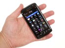
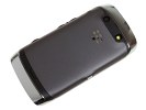
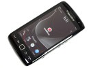
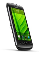
BlackBerry Torch 9860 live photosBlackBerry Torch 9860 360-degree spin
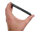
The BlackBerry Torch 9860 looks bigger than most of its 3.7" competitors. Extra space below the screen was needed to accommodate the standard set of physical buttons, all five of them. At 120 x 62 x 11.5 mm it isn't the most compact smartphone and has respectable heft. Tipping the scales at 135 g, it has every bit of BlackBerry solidity that users feel they're entitled to. Design and construction
| Display test | 50% brightness | 100% brightness | ||||
| Black, cd/m2 | White, cd/m2 | Contrast ratio | Black, cd/m2 | White, cd/m2 | Contrast ratio | |
| LG Optimus Black P970 | 0.27 | 332 | 1228 | 0.65 | 749 | 1161 |
| Apple iPhone 4 | 0.14 | 189 | 1341 | 0.39 | 483 | 1242 |
| HTC Sensation | 0.21 | 173 | 809 | 0.61 | 438 | 720 |
| Samsung I9000 Galaxy S | 0 | 263 | ∞ | 0 | 395 | ∞ |
| Sony Ericsson XPERIA Arc | 0.03 | 34 | 1078 | 0.33 | 394 | 1207 |
| Samsung I9100 Galaxy S II | 0 | 231 | ∞ | 0 | 362 | ∞ |
| BlackBerry Bold Touch 9900 | 0.29 | 403 | 1376 | 0.47 | 618 | 1304 |
| BlackBerry Torch 9860 | 0.29 | 426 | 1456 | 0.47 | 665 | 1413 |
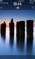
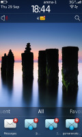
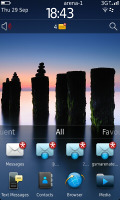
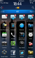
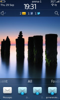
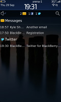
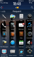
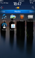
It has very good brightness and sunlight legibility won't be a problem. It's a pleasingly crisp display with excellent contrast and vibrant colors. The touch response is great but there's no haptic feedback. We particularly missed that in the keyboard. By the way, the virtual QWERTY is quite uncomfortable to use in portrait. Flip to landscape and things get better. How much better though will be ultimately up to Blackberry users coming from a physical keyboard to decide. Another thing to note, the auto-rotation has a notable lag. We hope this is a unit-specific issue. Under the display, is the typical BlackBerry navigation combo of Call keys, Menu and Back buttons. They're all big enough for comfortable use, slightly raised and solid to press. Placed in the middle is the trackpad, which will get its share of use, especially in the system menus that aren't all that touch friendly. The earpiece and status LED are the things to note above the display, where the BlackBerry logo takes a prominent spot. On the left side of the Torch 9860 there's only a MicroUSB port used for charging and file transfers. Its central position is not the most comfortable. A plugged cable will get in the way if you need to use the phone while charging. On the other hand, it favors landscape use. The 3.5mm audio jack is on the right side. Below it you have volume keys, with a very subtle mute button in between. It doubles as play/pause button in the music player. The convenience key near the bottom is set by default to serve the camera and this time it makes sense. The button is tiny but very tactile and has distinct half press for locking focus. The lock button is placed at the top of the BlackBerry Torch 9860, a return of the invisible keys from the previous generation of BlackBerries. The bottom of the phone has the same glossy plastic finish as the top and only features the microphone pinhole. At the back, the 5MP camera lens comes with a LED flash. A thin slit just above them marks the loudspeaker. The metal battery cover has rubbery finish, which feels nice to touch. A chrome frame runs around the back, with the top and bottom portions slightly raised to give the device a subtle inward curve. If you rest the phone on a flat surface the back panel won't get scratched or the loudspeaker muffled. The battery cover pops up as you push a tiny latch at the bottom. Underneath you'll see the 1230 mAh Li-Ion battery and the hot-swappable MicroSD card slot. The SIM compartment is under the battery, a tiny yellow handle helps eject the SIM card. BlackBerry claim 330h/320h of stand-by (in 2G and 3G, respectively) and 4:40/6:50 hours of talk time. Music playback should be around 44h. In real life our unit went through a day of intensive usage (web browsing over Wi-Fi, music playback, the usual imaging test, etc.). That's basically what you should expect of the Torch 9860 if you don't give your smartphone much rest. If used sparingly, the Torch 9860 will probably give you two days at most on a single charge. We don't have doubts about the build of the BlackBerry Torch 9860. We're not as impressed as usual with the design, although it has some of the typical BlackBerry touches. The phone feels solid, but not in the usual impressive and elaborate way. We think that's on purpose though - they didn't want the Torch 9860 too sophisticated or too masculine. The phone handles nicely. The fingerprint-prone front and the audio jack placed on the side are some minor niggles. The new OS 7 had a chance to demonstrate its newly found color, speed and agility in our BlackBerry Bold Touch 9900 review. The BlackBerry Torch 9860 is pretty much the same package in terms of software and features. The bigger screen is the difference - that and the physical keyboard, which is missing in the Torch. We are going to look at the OS 7 in detail again, for a complete and comprehensive coverage of the phone and its features. There are parts of reused text but that's inevitable given most of the interface is the same, only on a different scale. And you can rest assured that all the BlackBerry Torch 9860 specifics are duly reflected. Number 7 is the last upgrade of the OS before the switch to QNX. The OS 7 brings very few new features (NFC and HD video are well worth a mention though) and focus should be on the user experience instead. The new platform is based on a 1.2 GHz processor and more potent graphics hardware, and it’s exactly the higher system requirements that won’t allow older BlackBerry phones to run the new OS 7. BlackBerry OS 7 is trying to look like the QNX-based Tablet OS. The UI icons have been updated to mimic the PlayBook, but the rest is pretty much the same - functionality changes are kept to a minimum. The status area of the homescreen has virtual buttons in a row, allowing you to quickly toggle the cellular, Wi-Fi, NFC and Bluetooth radios. It gives you quick access too to the alarm clock and settings menu. Clicking on the loudspeaker icon underneath lets you change the currently active profile, while the magnifying glass on the other side of the homescreen lets you start a search. BlackBerry OS 7 is voice search enabled, too. Tapping on a small mic icon next to the Search bar will activate it. Missed events - SMS, email or missed calls - can be quickly accessed by pressing the bar between the search and profile icons on the default screen. Below that is the app tray, which consists of several tabs. You can easily swipe it out of sight or pull it up to show one to five rows of icons. Sideways swipes reveal the different panes that sort the main menu into All, Favorites, Media, Downloads and Frequent. The frequently used apps list are auto populated by the system. You can define which of the main menu panes should be shown. Folders can be added to the main menu and items can be moved into folders. You can either use the menu key or tap and hold on an icon to reveal options such as Move, Mark as Favorite, Move to folder. So, there is a trackpad and there is a touchscreen. The trackpad is the usual sharp and precise control. One place where it makes a lot of sense is in listed submenus that pop up as you press the Menu key. Not that they are not thumbable - it's just that wrong presses are completely ruled out with the trackpad. Pretty much everything you see is clickable in BlackBerry OS 7 and works the way it's supposed to. There are still small elements such as the homescreen Search and Profiles icons, which are easier to access via the trackpad rather than the touchscreen. The important thing to note is that, unlike the flat iOS layout, the Torch 9860 has a menu button to access options that are not visible on the screen. You get used to that pretty quickly though so in the end, the Torch 9860 manages to keep both new and returning users happy. Trackpad and touchscreen complete each other in a natural way. This post is uploaded via Apple iPhone 4, sponsored by Dr Mobiles Limited (Location Map) Web - FaceBook - Localist - Posterous - Twitter - Blogger - Flickr - Email Why Dr Mobiles Limited?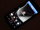
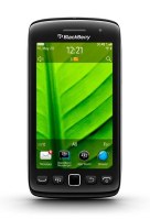
The 3.7" display on the Torch 9860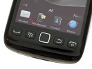
Trackpad and menu button still needed for navigation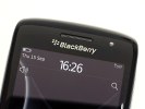
Earpiece and a status LED on top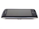
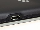
The microUSB port is on the left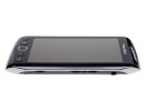
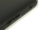
The volume control keys, placed either side the pause/mute button, and the camera button on the right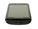
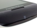
The Lock key is the single functional element on top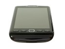
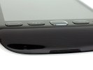
The bottom is where the microphone is
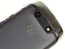
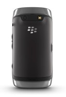
The metal back panel plate • 5 MP camera with LED flash • The loudspeaker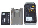
Taking a peek under the hood: the microSD card slot and removing the battery

The BlackBerry Torch 9860 feels great in the palm of your hand
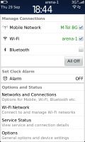
You can manage your wireless connections by selecting the status area and clicking on it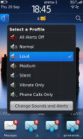
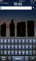
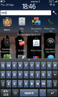
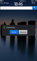
Profiles • The universal search works great
1 Huron Street, Takapuna, North Shore 0622, Tel: (09) 551-5344, Mob: (021) 117-2222
> Repair while you wait
> Free insurance calims report
> Free inspection on faulty phones|
> Free 30 minute off-street parking
> 45 mins to fix iPhone 4 scree
> 30 mins to unlock 3G and 3GS
> 25 mins to replace 3G/3GS screen
> 10 mins to unlock iPhone 4


