We put together a primer for iOS 4, and then we gave you acomprehensive iOS 4 review of the most significant new features. Now it’s time to explore more of the finer details of iOS 4—the new features and polish that may not make it to Apple’s product pages, but may still make someone’s day.
Home screen
As usual, Apple snuck a number of new features into almost every facet of iOS, so let’s start with the first thing that most people see when they use an iPhone: the Home screen. Now, you probably already know about the major new features like folders for organizing apps and support for wallpaper backgrounds (just like the iPad feature), but we’ve found a couple more perks as well. First, the Spotlight screen now offers “Wikipedia” and “Web” options at the bottom of your search results. If you don’t find what you’re looking for locally, these are two easy launchpads for taking your query out to the Web.
The second Home screen bonus is that if you use one of thereadily available apps to enable emoji icons on your device, you can use them to name your Home screen folders. In fact, you don’t need a text label at all—iOS will let you use even just a single emoji icon to label a folder.
Multitasking

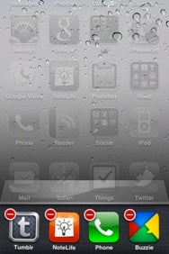
You can indeed remove an app from the multitasking bar at the bottom of the display. To do so, tap and hold on an icon, just as if you wanted to move icons around on the Home screen. The icons will start jiggling, and a red minus sign will appear at the top left of the icon. Tapping the minus will immediately close the app with no confirmation, warning, or ability to reverse your choice, so be sure that the app either automatically saves your work or that you were truly done using it.
Phone
Moving along the key apps and features of iOS, the Phone app got a little attention in this update. On iPhone 4, the FaceTime button appears to have knocked off the Hold button on the in-call screen (our guess is that hold seemed a little redundant in light of Mute and the ability to move the phone away from your face). Thanks to Nik Fletcher’s observations, the “End Call” button has been re-labeled to simply “End,” and the in-call background image now stretches all the way to the bottom of the screen (previously, it stopped just above the End Call button).
Mail is at the head of the pack when it comes to major changes in iOS 4, and we covered them in our main review and our hands-on Mail piece. The app also got quite a bit of spit and polish that warrants a mention.
If a message is from a contact in your device’s Address Book and a picture is assigned, that picture will appear to the right of the subject when viewing that message. If you start drafting a message in Mail or any other app and then hit Cancel, the menu that appears now features a loud, red “Delete Draft” button to help make sure that you know what you’re doing.
Mail also gains some custom e-mail service features: it now supports MobileMe aliases and archiving in Gmail—both unique features to their respective services.

Mail also gained some new preferences in the Settings app. Under the Mail, Contacts, and Calendars pane, you can pick a default account with which to sync new notes from Apple’s built-in Notes app, and you can disable the new threaded conversation view.
Safari
In addition to gaining Bing as a search option and other perks we’ve already mentioned, Apple endowed its mobile browser with search suggestions that appear as you type, just like in a desktop browser. (This works with all three search engine options and is, of course, dependent on having a stable Internet connection.) When typing in the address field, URL suggestions from your bookmarks and history now include both the URL and page title. Apple also tightened up the interface when you tap on either Safari’s search or location fields—the Cancel button is now next to the the field, instead of above it, cutting down on the amount of space that it occupies.
iPod

The iPod app may take the cake when it comes to the sheer number of nips and tucks that Apple made to its iOS 4 apps, which is why we spentan entire article on it. The album view got a serious face lift, as it now displays album art in a larger area at the top, along with metadata like release date, total playing time, individual track length, and more. In addition to now being able to edit playlists (including the ones you sync from iTunes), a “Clear” button makes it easy to start fresh. The iPod app also respects iOS 4’s new system-wide orientation lock; when it’s enabled, Cover Flow will not appear when rotating your device.
When viewing a TV show’s list of episodes, there is a new “Get More Episodes...” button at the bottom (note that it does not appear in playlists). Lastly, a new option in Settings -> iPod lets you toggle the display of lyrics or podcast info during playback (previously, if you entered lyrics data, it always showed up in conjunction with the playback scrubber).
Finally, with a hat tip to Iljitsch van Beijnum, links embedded in enhanced podcasts can now be opened in Mobile Safari.
iTunes Store
There is no more iTunes Plus designation on music tracks—the higher 256Kbps quality, DRM-less format has been the norm for some time, so Apple has apparently seen fit to do away with pointing it out.
YouTube
Videos will rotate to portrait mode, but only after they start playing in landscape. Then you can turn the phone upright and the video will follow (iPod videos gained portrait rotation sometime in iOS 3.x). If you turn the phone to portrait before the video starts playing, it will remain in landscape orientation—we’re not sure if this is a feature or a bug, but it seems like a bug.
Notes

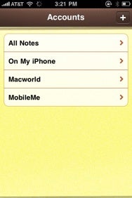
Since Notes can now sync with multiple sources (iTunes, MobileMe, and so on), a new button in the top left lets you view all the accounts that support notes. This also means you get a choice when creating notes—you can keep them “On My iPhone” or sync them with MobileMe or any other supported e-mail account. There is also a new option under Settings -> Mail, Contacts, Calendars to pick a default account with which to sync notes.
Calculator
For the third time in the iOS’s history, Calculator has gained a new icon.
Settings
What’s a major iOS update without a healthy dose of new preferences and rejiggering? Under the General pane, Accessibility has gained a “Large Text” option to increase text size in Mail, Contacts, Messages, and Notes. Spotlight Search (which lets you toggle and reorder search results) was moved and renamed from General -> Home -> Search Results, and it now includes an entry for Messages.
The General -> Home option, meanwhile, has been removed altogether. In previous iOS versions, the Home pane let you assign different actions for double-pressing the Home button (such as opening Camera, iPod controls, Search, and so forth). But on devices that support multitasking, double-pressing the Home button is now hardwired to opening the app switcher. (If there was ever a strong argument for the iPhone gaining a dedicated camera button, the loss of these options may be it.)
Under General -> International, a new Calendar option lets you pick between using Gregorian, Japanese, Buddhist, and Republic of China calendars. The International Assist option under General -> Phone has also been moved from the top of the pane to below the “Calls” option area.
Safari gained a couple new options, too. Under Search Engine, you now have the choice of Bing in addition to Google (the default) and Yahoo. (The Search panel to the left of the Home Screen respects this search engine choice if you opt to take your query to the Web.) Interestingly, the Plug-ins slider has been removed entirely.
Messages also has a couple of new preferences: the Group Messaging option (enabled by default) lets replies come back to the original, single thread you created when sending the first message, instead of to the individual SMS entries for each contact in a group. A Character Count option can now display—you guessed it—a character count when composing SMS. The iPhone will display SMS of any length as one coherent message, but the carriers and most other phones still break them up into 160-character messages. Some SMS-enabled services, like Twitter, also enforce a low character count. Interestingly: the character count only appears above the Send button if your message stretches to a second line.
Any more diamonds in the rough?
That’s it for the hidden iOS 4 gems that we’ve been able to find so far. How’d we do? Did we miss anything? Let us know in the comments if you’ve discovered something that slipped by our eagle-eyed contributors.
This post is sponsored by:Dr Mobiles Limited
1 Huron Street, Takapuna, North Shore 0622
Tel: (09) 551-5344 and Mob: (021) 264-0000
Web - Map - Email - Posterous - Twitter - Blogger - Flickr

No comments:
Post a Comment